Essay
Introduction
An ident is short for “identification” (Oxford Dictionary, 2019)[1] and are a short sequence of video footage to identify the channel that the viewer is watching. They vary in length, usually being 3 seconds long, to 30 seconds; some contain a voice over introducing the next programme, hence the longer length. Good branding can encourage brand loyalty, if it is consistent and targets the audience successfully.
Design
The design of an ident is important, to brand the channel. It must be tailored to the viewer currently watching, with different design elements and graphics. The density of information portrayed depends on the purpose of the ident; some are designed just to identify the channel, whilst others contain a voice-over to segment the channel schedule and inform the viewer of later programming. The tempo can also depend on the previously mentioned purpose, but also the target audience; older audience would lean towards a channel with a slower pace, whilst the opposite is true for younger audiences.
Typography is important to keep in mind during production of an ident. The font must appeal to the style of the channel and be readable and recognisable by its target audience. The typography can be either serif or sans-serif. A serif is a “decorative stroke that extends from the letter” (Cousins, 2019)[2]. These give the channel an elegant style, which may or may not fit the branding.
An example of typography being used to represent a brand is the Sky channel branding; their three different channels contain similar idents, that use the same typography style throughout. The font is recognisable as Sky, and the different branding colours represent which specific Sky channel the viewer is watching.
Another key point is graphic elements on-screen. It needs to be consistent with the branding and logo of the channel, so that the visual style is consistent. Graphical elements can include anything from CGI elements, to animation, to logo designs.
BBC One has a red textured circle that appears throughout the channel branding. It is designed to represent their theme of coming together, and wholeness. The video always contains a circle, that the red graphic can complement; this allows the brand to be instantly recognizable.
Music can change how an ident is perceived; it can either be incidental or theme music. Theme music can instantly recognise a brand and tie the sound to the brand (and communicating an audible cue to the audience as to what channel is being listened to). Incidental music allows for more experimentation in the visual aspects of the ident, as you are not tied to a specific audio cue.
The THX ident is instantly recognisable by its audio cue. Without seeing visuals on-screen, the ident audio brands the company, and allows the audience to know who was involved without even seeing visuals on-screen.
Limitations of Broadcast
There are limitations to idents. When broadcasting on TV, most programmes and channels now broadcast in an aspect ratio of 16:9. This means any footage taken from films (usually filmed in either 1.85:1 or 2.39:1 (Andresconrado, 2019)[3], with the former being for US films and the latter being anamorphic theatrical showings in the UK) must be scaled to fit and fill the screen.
In a similar vein, the resolution of most digital TV channels now broadcast in 1080p or 1080i, and the video footage must match this; progressive and interlaced video renders differently on screen. Interlaced video signals contain two fields, that are on even and odd lines of the video, and each field is alternated in being displayed on screen. This is compared to progressive scan, which displays each from in full before moving to the next frame. This is important for idents, as idents must match the format and codec which the TV channel is broadcasting on, otherwise visual artefacts will appear on-screen during the de-interlacing process.
An example of interlaced footage not displaying correctly after producing an ident is a mock ident created as an example for Television South. Their TVS DVE Weekend Ident (Jeffery, 2014)[5] contains interlace comb artefacts, that change how the video is displayed on-screen. Since the elements are moving horizontally from the frame, you can see the fields separating, causing the ident to look less polished than if it was designed with interlaced footage in mind.
Additionally, digital video vs analogue video can cause some issues during broadcast. Analogue video is prone to interference, meaning that occasionally, footage shot will not look as it was intended. Analogue video also has an over-scan area, so on-screen graphics cannot be placed in the corner, in case it is cropped off during broadcast. Digital video, on the other hand, has no interference, but is prone to compression artefacts, meaning certain on-screen elements (such as gradients), may appear blocky on-screen. This will affect any video footage with a gradient somewhere in frame, which will be noticeable on idents. This needs to be kept in mind during production. In 24-bit colour, “there are so many values, you will see them [banding] if you have a shallow gradient”. (Van Hemert, 2019)[6]
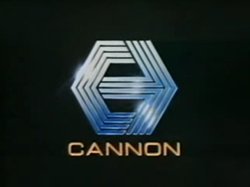
An example of video compression would be the Cannon Video ident, for their independent production company. A limitation of analogue video means that the ident is blurred and looks fuzzy. Solid colours (such as the black in the background) lack depth and has colour-banding on what is supposed to be a solid colour. This needs to be kept in mind during production of an ident; compression and artefacts can greatly change the final output. (Cannon Video, n.d.)[7]
Conclusion
In conclusion, an ident represents a channel, and can allow the audience to gain brand loyalty, if branding is consistent across channels and content, and it is tailored correctly. Both design and limitations of the medium need to be considered when producing an ident.
References
[1] Oxford Dictionary. (2019). Ident | Oxford Dictionaries. [online] Available at: https://en.oxforddictionaries.com/definition/ident
[2] Cousins, C. (2019). Serif vs. Sans Serif Fonts: Is One Really Better Than the Other? [online] Designshack.net. Available at: https://designshack.net/articles/typography/serif-vs-sans-serif-fonts-is-one-really-better-than-the-other/.
[3] Andresconrado (2019). Aspect ratio (image). [online] Wikipedia. Available at: https://en.wikipedia.org/wiki/Aspect_ratio_(image)#/media/File:Filmaspectratios_svg.svg
#/media/File:Filmaspectratios_svg.svg)
[4] Computerphile. (2016). The Interlaced Video Problem. [online] Available at: https://youtu.be/rCUjvK-zbHw
[5] Jeffery, D. (2014). Television South Ident Assortment. [online] Available at: https://youtu.be/4_zS-1RNfqs?t=28
[6] Van Hemert, T. (2019). How to fix video posterization (banding). [online] YouTube. Available at: https://youtu.be/I9d8bg2gnug
[7] YouTube. (n.d.). Cannon video logo. [online] Available at: https://youtu.be/xZVzfZY33og